Introduction
The goal of this lab was to reassess the data collected from the first assignment when elevation grids were created from a sandbox terrain model. This coordinate and elevation data was recorded in a field notebook, then transferred to an excel document. This spreadsheet, of course, was not normalized. The first step in interpolating the resulting point data from assignment one was to normalize the dataset.
Methods
To normalize the data, means to organize data files (.xlsx, .txt, etc) so that their information can be understood by the programs their being used with and create an visually pleasing and easy-to-follow dataset.
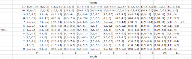 |
| Figure 1: Raw excel data. |
From the data shown in figure one, this table would not be readable/usable in ArcMap. There are cells in columns and rows missing, as well as a few different data types. This data mess was organized into three columns, an X, Y, and Z column were used to normalize the data (figure 2). This dataset was then ready to be used to create points in ArcMap.
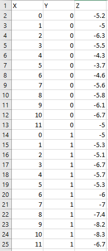 |
| Figure 2: Normalized dataset. |
The normalized data was brought into ArcMap by using the
Table to Table tool (figure 3).
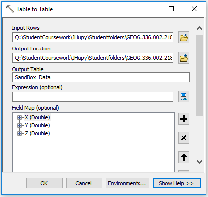 |
| Figure 3: Table to Table tool. |
In figure 3, the excel sheet file was used as the input rows and a geodatabase was used as the output location with the name,
SandBox_Data. The table was opened to check for correct data transfer. A new point feature layer was created using the
File > Add X Y Data command from the ArcMap menu.
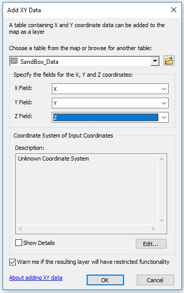 |
| Figure 4: Add XY Data. |
This step made it clear as to why normalizing the data before bringing it into the software is an important step. Because the X and Y values were just arbitrary coordinates from the field activity, however, the points do not have a projected coordinate system. The Z values are what really matters for this exercise, so this was fine.
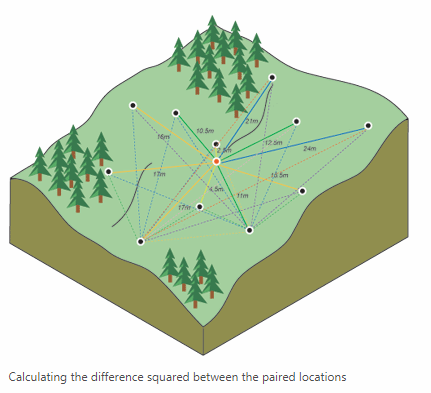
The first method of interpolation was the Inverse Distance Weighted (IDW) method. This method of interpolation assumes that the further a point is from a sample point, the less impact the sample value has on that point.
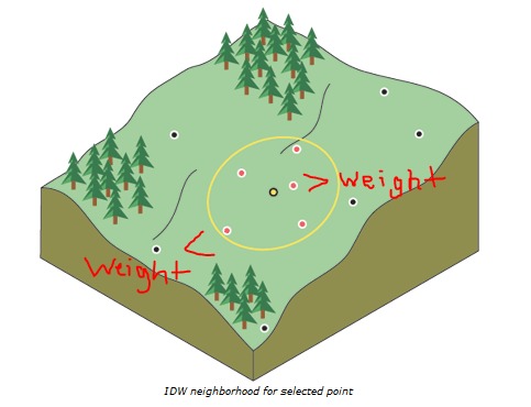 |
| Figure 5: Points least and most affected by yellow sample point (ESRI). |
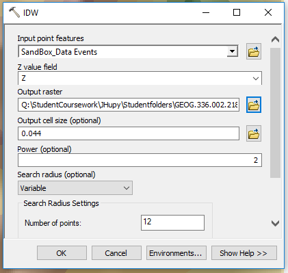 |
| Figure 6: Using IDW tool in ArcMap. |
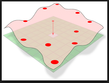
Next was the
Natural Neighbor method. This method of interpolation defines equal areas surrounding data points and supplies the input point the same value of the area it falls within.
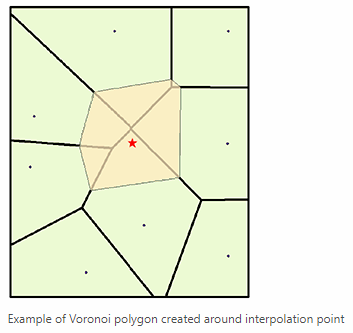 |
| Figure 7: Natural Neighbor interpolation method. The polygons represent equal areas between each point. (ESRI) |
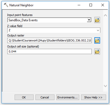 |
| Figure 8: Using Natural Neighbor tool in ArcMap. |
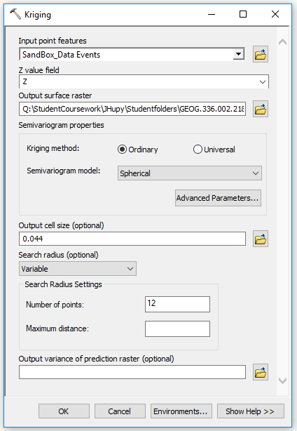
Then, the
Kriging method of interpolation was used. This method calculates the distance and/or the direction of the points surrounding an input point and uses correlation methods to determine how that area is shaped.
 |
| Figure 9: Determining an area's profile based on correlations of surrounding points using Kriging interpolation. (ESRI) |
 |
| Figure 10: Using Kriging tool in ArcMap. |
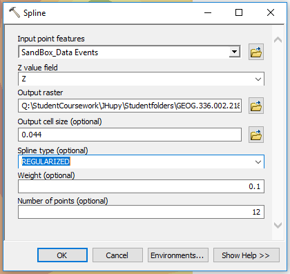
Another interpolation method used in this lab was the
Spline method. This method attempts to reduce the curvature of the surface by only using heights that are at or below the sample points around the input point/s.
 |
| Figure 11: Spline tool visualization. (GIS Resources) |
 |
| Figure 12: Using spline tool in ArcMap. |
Lastly, the
TIN interpolation method was used. This method forms a triangular network between points of known elevations which results in 2-dimensional triangles forming a 3-dimensional surface.
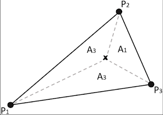 |
| Figure 13: With three points of known elevation, the areas and central point within the plane can be given slope, height, and azimuth information. (Research Gate) |
 |
| Figure 14: Using TIN tool in ArcMap. |
Once all of these interpolation methods generated a digital surface result, they were brought into ArcScene to generate a 3-dimensional rendering to be used in the resulting maps. Setting the layers to float on a custom surface and assigning them exaggerated z-values, resulted in 3-dimensional representations of the surface collected in the field.
Results
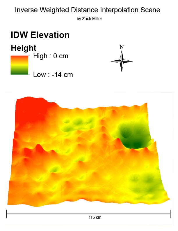 |
| Figure 15: IDW result. |
The vertical exaggeration is visible for each point in this method's result. Since the original model was made in sand, this representation does not accurately represent the real life features its portraying.
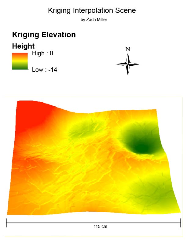 |
| Figure 16: Kriging result. |
This scene's vertical exaggeration is more gradual, which also doesn't do a good job of depicting the actual sand model. There are also ridge lines in the model which there wasn't in the sand model.
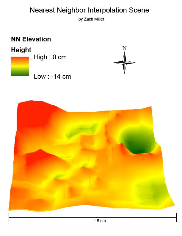 |
| Figure 17: Natural Neighbor result. |
Looking almost like a mixture of the first and second results, this model exaggerates peaks of collected point elevations and appears more jagged than in real life.
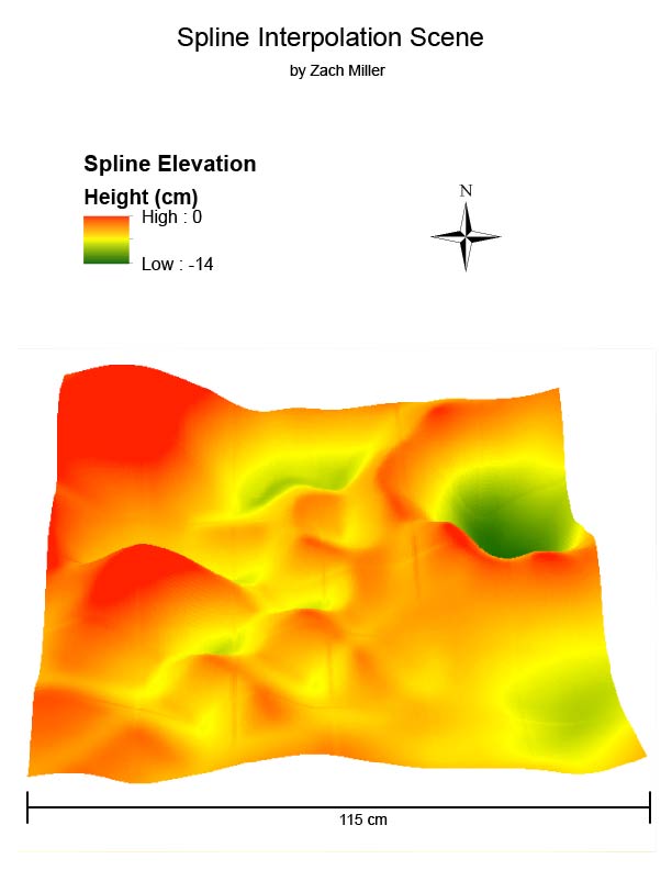 |
| Figure 18: Spline result. |
This model is the most realistic-looking rendition of the sand model due to its smoothness of peaks and valleys. Although the peaks throughout the middle are not as they appeared in the sand model, the shapes and characteristics of the other features are realistic.
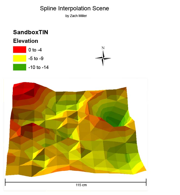 |
| Figure 19: TIN result. |
This model uses a triangulated network of planes to show a blockier version of the sand model.
Discussion
From normalizing the data table of X, Y, and Z values to rendering a 3-dimesional model of the sand box topography this lab started with was pretty amazing. Although none of the interpolation methods generated an extremely realistic rendition of the sand box, the process was interesting to endure. I think if there were more elevation points collected, the resulting interpolated models would have turned out more accurate. Since there was a lot of space in between each point collected the interpolation had to do a lot of work to fill in missing data and created multiple peaks where there was a continual ridge for instance.
Overall, I thought the Spline method generated the best result out of the interpolation methods used. The smoothness of the rendering was the most true to the actual sandbox model.
Sources
Zach Miller, Bayli Vacho, and Jake Dewitte
Dr. Joe Hupy
ESRI
GIS Resources
Research Gate


No comments:
Post a Comment