Thursday, December 14, 2017

Assignment 11: Processing UAV Imagery in Pix4D

Introduction

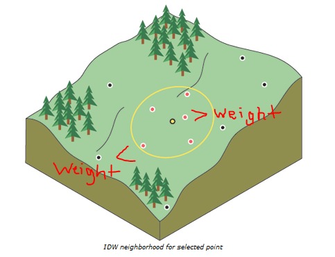
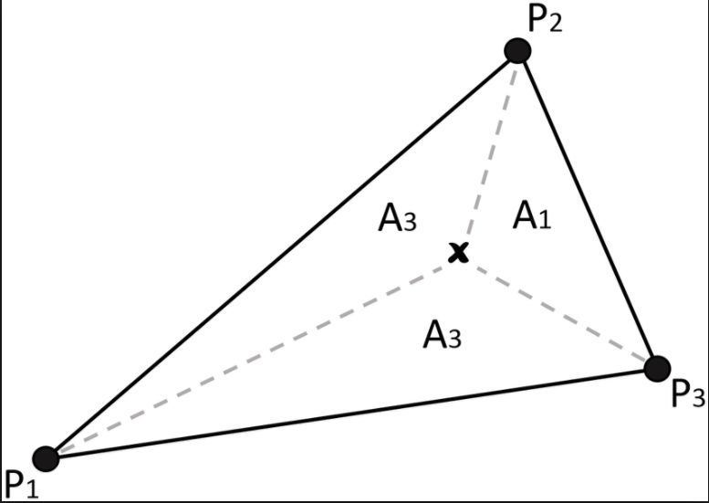
The goal of this lab was to visualize the difference between good and bad data through image processing. Using images collected with a DJI Phantom 3 from the Litchfield lab, two orthomosaic and digital surface model (DSM) renderings of the images were generated: one of which was geolocated with Geographic Coordinate Points (GCPs) and the other was not.

Methods

Part I: Image Processing with out GCPs

To begin this lab, a folder containing over 200 pictures was brought into a new Pix4D project as a directory. The project was given a name containing the date of collection, the site, and the unmanned aerial vehicle (UAV) used. This way, the project information is in the title to maintain proper file management. This is especially helpful when recalling projects with the same site and/or sensor.

A few parameters were established before initial processing. The Shutter Type was changed to Rolling Shutter and the Coordinate System was changed to Universal Transverse Mercator (UTM); a metric-based coordinate system (the UAV used in this lab is also based in metric units). Then, the 3-D Map template was chosen to generate DSM, Orthomosaic, 3-D Mesh, and Point Cloud renderings of the input images.

Figure 1: Choosing a processing template.

Once the template was selected, initial processing could commence. Initial processing generated a rough 3-D point cloud and initial quality report. The quality report flagged many problems with the data.

Figure 2: Quality check post-processing.

Figure 3: Areas of overlapping pictures within the study area.

Figure 4: Camera tilt upon image capture.

As shown in the Quality Check, 26 images weren't calibrated and there were no GCPs to correct the imagery. The Overlap and Camera Movement figures show that the wooded area on the southern side of the mine site caused some issues with the sensor. Notoriously, trees and geographic image processing do not mix well. Due to the nature of branches and trunks of trees, UAV sensors tend to react negatively to those projections which could've caused the odd camera angles and lack of overlap within that area.

Despite numerous flaws with the data after initial processing, the remaining processing was completed.

Figure 5: Adjusting the DSM method parameter before initiating secondary and tertiary processing. 

For DSM generation, triangulation was used while all other default parameters were untouched. A final point cloud, triangle mesh, DSM, and orthomosaic were generated (see results).

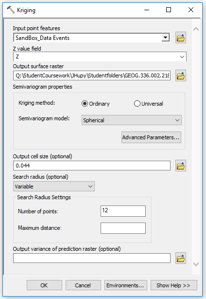
Part II: Image Processing with GCPs

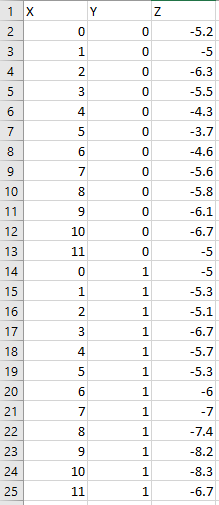
For the second part of this lab, a copy of the first project was used, and this time, GCP locations were imported and used to enhance the spatial accuracy of the resulting models. To do this, a .txt file containing the locations of the 16 GCPs used during this flight was placed in the project via the GCP/MTP Manager.

Figure 6: Importing GCP files within the GCP/MTP Manager window.


Figure 7: Map view of input image (red dot) and GCP (blue cross) locations.


Figure 8: Ray cloud viewer showing oblique view of image capture and GCP elevations.

In figure 8, the floating blue joysticks above the floating blue, green, and red spheres represent the GCPs which are positioned at the true elevation of the earths surface. The cameras and point cloud are positioned at incorrect elevations which would affect the areas and volumes of the products. In the next step, the image capture elevations were pulled up to their true positions on earth.

Once the GCPs and their respective coordinates were placed into the GCP manager window, the Basic Editor function was used to locate each GCP in two or more images to facilitate spatial correction of the images.
Figure 9: The yellow cross represents a user-entered location of  the center of the GCP in an image. 

By sifting through the images in the Image Window, the associated GCPs were identified and their centers (the point on the GCP where the associated coordinates are located) were marked. Once all of the GCPs were located in two or more images, the Reoptimize processing tool was used to spatially correct the images.

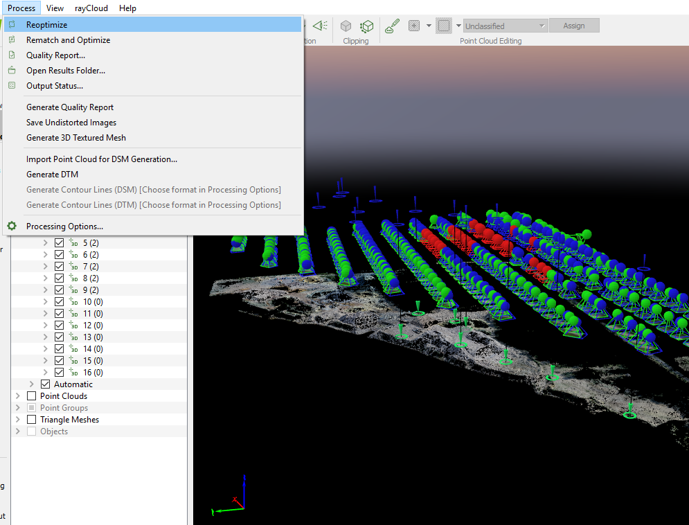
Figure 10: Navigating to the Reoptimize Tool in Pix4D.

Figure 11: The blue spheres represent the "pre-spatial correction" elevations of image captures and the green spheres represent the spatially corrected elevations.

Figure 12: Ground locations of GCPs after correction.

Then, secondary and tertiary processing were done once more to produce a spatially accurate point cloud, triangle mesh, DSM, and orthomosaic (see results).
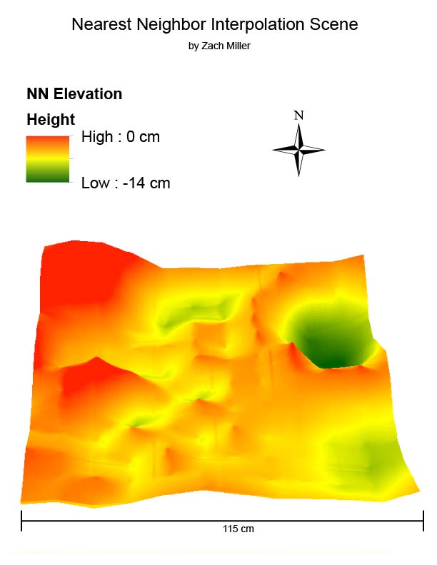
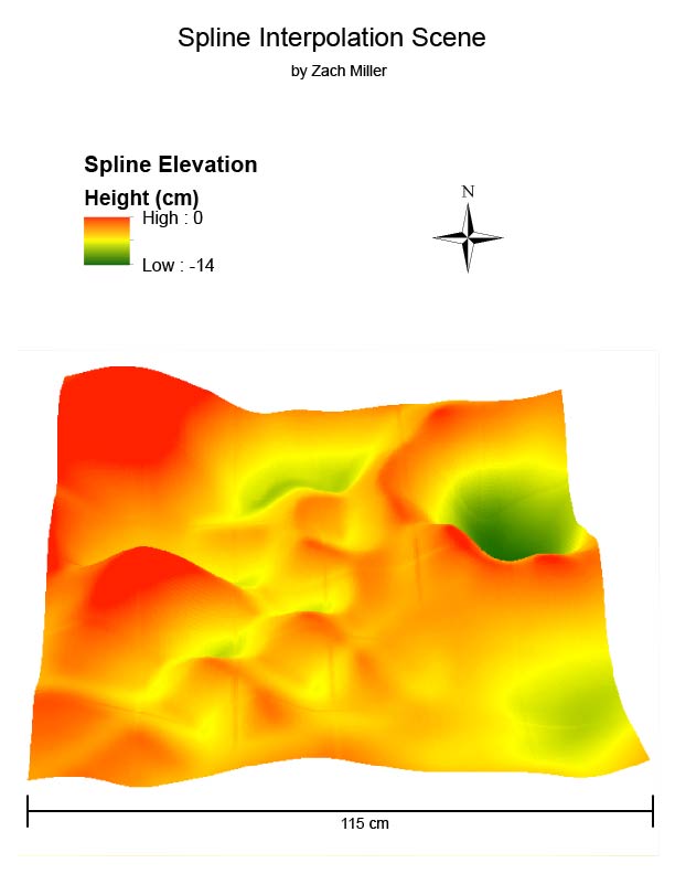
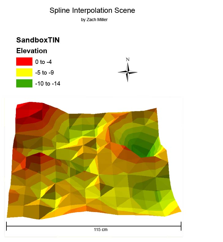
Results
Figure 13: Result from Part I DSM.
Figure 14: Result from Part II DSM.
Figure 15: Result from Part I orthomosaic.

Figure 16: Result from Part II orthomosaic.

Discussion


After looking at the DSM results, there are some very distinct changes that happen between the one that used GCPs and the one that did not. Feature elevations in the image using GCPs become relatively higher across the study area. The minimum and maximum values associated with either output have changed. This is important due to the fact that the average elevation of Eau Claire is about 274 meters, and before correction, the elevations were significantly lower than on earth. Both images display an erroneous area near the southern portion of the map, however. This area is dominated by tree canopy cover, and the sensor could not properly record the elevations of those features in either image.

The orthomosaics on the other hand, do not contain many noticeable changes of features. There are some small but visible changes in the bottom-left, bottom-right, and top-right corners of the study area, if one looks closely. The image's alignment with the north-south road and east-west road as well as the dirt path in the northern portion of the study area shift and change in shape to reflect those features as they would appear truthfully on the ground. The basemap underneath the orthomosaic helps in visualizing these changes.

Overall, I found this lab to be an insightful examination of how GCPs can be used to more accurately represent products of remotely sensed data. By processing the DSM and orthomosaicked image without GCPs and comparing the results with products that did use GCPs, it showed that GCPs had an effect on the quality and precision of the products. This is an important consideration when determining which software, functions, and products to use for a project where accuracy is vital.

Sources


ArcMap geoprocessing and mapping (2017). Cartography by Zach Miller.


Eau Claire County - Wisconsin County Coordinate System [PDF]. (1995). Wisconsin Coordinate Systems. Average elevation figure.

Peter Menet and Dr. Joe Hupy of Menet Aero (2017). Flight data.

Pix4D image processing (2017). Image processing and geometric correction.

Sunday, December 3, 2017

Assignment 10: Visualizing Survey Elevation Data with Interpolation Methods

Introduction

The goal of this lab was to reassess the data collected from the first assignment when elevation grids were created from a sandbox terrain model. This coordinate and elevation data was recorded in a field notebook, then transferred to an excel document. This spreadsheet, of course, was not normalized. The first step in interpolating the resulting point data from assignment one was to normalize the dataset.

Methods

To normalize the data, means to organize data files (.xlsx, .txt, etc) so that their information can be understood by the programs their being used with and create an visually pleasing and easy-to-follow dataset.

Figure 1: Raw excel data.
From the data shown in figure one, this table would not be readable/usable in ArcMap. There are cells in columns and rows missing, as well as a few different data types. This data mess was organized into three columns, an X, Y, and Z column were used to normalize the data (figure 2). This dataset was then ready to be used to create points in ArcMap.

Figure 2: Normalized dataset.
The normalized data was brought into ArcMap by using the Table to Table tool (figure 3).

Figure 3: Table to Table tool.
In figure 3, the excel sheet file was used as the input rows and a geodatabase was used as the output location with the name, SandBox_Data. The table was opened to check for correct data transfer. A new point feature layer was created using the File > Add X Y Data command from the ArcMap menu.

Figure 4: Add XY Data. 
This step made it clear as to why normalizing the data before bringing it into the software is an important step. Because the X and Y values were just arbitrary coordinates from the field activity, however, the points do not have a projected coordinate system. The Z values are what really matters for this exercise, so this was fine.

The first method of interpolation was the Inverse Distance Weighted (IDW) method. This method of interpolation assumes that the further a point is from a sample point, the less impact the sample value has on that point. 

Figure 5: Points least and most affected by yellow sample point (ESRI).
Figure 6: Using IDW tool in ArcMap.
Next was the Natural Neighbor method. This method of interpolation defines equal areas surrounding data points and supplies the input point the same value of the area it falls within.

Figure 7: Natural Neighbor interpolation method. The polygons represent equal areas between each point. (ESRI)
Figure 8: Using Natural Neighbor tool in ArcMap.
Then, the Kriging method of interpolation was used. This method calculates the distance and/or the direction of the points surrounding an input point and uses correlation methods to determine how that area is shaped.

Figure 9: Determining an area's profile based on correlations of surrounding points using Kriging interpolation. (ESRI)

Figure 10: Using Kriging tool in ArcMap.
Another interpolation method used in this lab was the Spline method. This method attempts to reduce the curvature of the surface by only using heights that are at or below the sample points around the input point/s.

Figure 11: Spline tool visualization. (GIS Resources)
Figure 12: Using spline tool in ArcMap.
Lastly, the TIN interpolation method was used. This method forms a triangular network between points of known elevations which results in 2-dimensional triangles forming a 3-dimensional surface.

Figure 13: With three points of known elevation, the areas and central point within the plane can be given slope, height, and azimuth information. (Research Gate)

Figure 14: Using TIN tool in ArcMap.
Once all of these interpolation methods generated a digital surface result, they were brought into ArcScene to generate a 3-dimensional rendering to be used in the resulting maps. Setting the layers to float on a custom surface and assigning them exaggerated z-values, resulted in 3-dimensional representations of the surface collected in the field.

Results


Figure 15: IDW result.
The vertical exaggeration is visible for each point in this method's result. Since the original model was made in sand, this representation does not accurately represent the real life features its portraying.
Figure 16: Kriging result.


This scene's vertical exaggeration is more gradual, which also doesn't do a good job of depicting the actual sand model. There are also ridge lines in the model which there wasn't in the sand model.
Figure 17: Natural Neighbor result.
Looking almost like a mixture of the first and second results, this model exaggerates peaks of collected point elevations and appears more jagged than in real life.
Figure 18: Spline result.
This model is the most realistic-looking rendition of the sand model due to its smoothness of peaks and valleys. Although the peaks throughout the middle are not as they appeared in the sand model, the shapes and characteristics of the other features are realistic.
Figure 19: TIN result.
This model uses a triangulated network of planes to show a blockier version of the sand model.

Discussion

From normalizing the data table of X, Y, and Z values to rendering a 3-dimesional model of the sand box topography this lab started with was pretty amazing. Although none of the interpolation methods generated an extremely realistic rendition of the sand box, the process was interesting to endure. I think if there were more elevation points collected, the resulting interpolated models would have turned out more accurate. Since there was a lot of space in between each point collected the interpolation had to do a lot of work to fill in missing data and created multiple peaks where there was a continual ridge for instance.

Overall, I thought the Spline method generated the best result out of the interpolation methods used. The smoothness of the rendering was the most true to the actual sandbox model.

Sources

Zach Miller, Bayli Vacho, and Jake Dewitte
Dr. Joe Hupy
ESRI
GIS Resources
Research Gate

Tuesday, November 28, 2017

Assignment 9: ArcCollector 2

Introduction

The purpose of this lab was to expand on skills acquired in assignment 7- using the ArcCollector app to obtain field data and creating maps with the collected information. For this assignment, each student was able to create and collect data for a topic of their choice. The requirements for this project stated that a minimum of three fields of data were to be collected (a text field, an integer field, and a category field).

Collection Criteria

The data collected in this project pertained to street lights of the third ward neighborhood of Eau Claire. The study area is shown in the resulting maps, but essentially, it consisted of every accessible drive south of Washington St, east of State St, and north/west of the Putnam trail and Harding Ave. to be classified as a street light, the light had to be taller than 8 ft, attached to a pole, and accessible by vehicles (this includes residential parking lots). Only lights within the study area were counted (ie. streetlights on the west side of State St were not counted, but lights on the east side of State St were). The attribute information collected consisted of: bulb type, number of lights (per pole), pole type, operational status, and notes.

Methods

The first steps in achieving this assignment's initiatives were to create and publish a blank point feature map, this was done using ArcMap and ArcGIS online. To begin, a blank map document was created and a new geodatabase was made within the project folder. The geodatabase serves as a host for the feature layer(s). The domains and subtypes of the geodatabase were established, setting the parameters for aforementioned feature classes.

Once the database was established, the street light point feature was added to the geodatabase. The bulb type, number of bulbs, pole type, operational status, and notes fields were created. Every field besides the number of bulbs and notes attributes were categorical, using coded values within the field parameters that provided options for field collectors to choose from.

Then, the blank feature service was published to ArcGIS Online and saved as a web map. Since feature access was enabled within the service, end-users would be able to add points to the map when using the app.

To collect the data, the ArcCollector app for iPhone and a longboard were used. The data was collected by riding around the Third Ward neighborhood and collecting information about street lights on every street within the study area. The data was collected at night to ensure the bulbs were functioning properly.

After the data was collected, the point information was opened in ArcMap to create the maps shown in the results section.

Results

To create the resulting maps, the study area was digitized as a polygon feature class and the point data was symbolized by both bulb type and pole type fields.


Figure 1: Street light map of bulb type.

Figure 2: Street light map of pole type.
Discussion

Looking at the results, there are some noticeable patterns, such as the amount of lights on more heavily trafficked roads such as State St, Washington St, and Summit Ave. For the most part however, the coverage of street lights in the Third Ward is pretty standard- there's a light on almost every corner, when there are large bends in roads, or splitting long roads.

As far as the validity of the data, the application has about a 16.4 ft location accuracy, so the locations of each street light within the resulting dataset has a potential to be inaccurate. My knowledge on various bulb types is also limited, so this could also affect the validity of the data. 

Tuesday, November 14, 2017

Assignment 8: Navigation with a GPS and Compass

Introduction

The goal of this lab was to navigate to a series of points at UW - Eau Claire's Priory land. The class was broken into groups of three, and the coordinates of each point were given to each group. Using a GPS and the Bad Elf app for iPhone in the first part, each group found their way to the marked points. In the second part, students were instructed to use a compass and pace count to plot and navigate to three of five original points.

Study Area

Expanding on assignment 4, the area for this activity was the land around a UW - Eau Claire residence hall, the Priory (figure 1).

Figure 1: Map of study area.

Methods


The equipment used in the first part of this lab included an iPhone- with the Bad Elf app installed, Bad Elf GPS unit, Compass, map of study area with a Universal Transverse Mercator (UTM) coordinate system, and a field notebook (see figure 2).

Figure 2: Required tools for part 1 of this lab.

Part I - GPS Navigation


As previously mentioned, each student group was given a list of five coordinates in UTM for which they were responsible for navigating to. Before heading into the field, my group got a general sense of where each of our points were using the coordinate labels on the map.

Figure 3: Using the Bad Elf app and navigation map to find our location.

From there, the group used the Bad Elf GPS unit (which was synched to the Bad Elf app for iPhone, creating a tracklog of our progress) and compass to find our way to each point using a best sequence of nearest to farthest. We figured the terrain might be challenging and should cut time between points as much as possible. Once the coordinates on the iPhone were close to the coordinates given to our group we could usually see the marked tree and took a picture at each one.

Figure 4: Marker 1.
Figure 5: Marker 2.
Figure 6: Near marker 3.

Figure 7: Marker 4.
Figure 8: Marker 5 (pink ribbon in fallen branches, right of tree).


Part II - Compass Navigation

After navigating to each of the points in our course, the groups returned to the parking lot to begin the second part of the lab. This started by gathering a pace count. Dr. Hupy measured a length of 100 meters and each student walked that length, counting every other step, to get a pace count. The point of this was to determine how far 100 meters was so that when each group plotted their routes to each point, they could determine about how far it was between them. 

Next, Dr. Hupy demonstrated how to use the compass we did for this part of the activity.

Figure 9: Dr. Hupy demonstrating how to use a compass for navigation.

The compass worked by using the side to connect two points together on the map, determining the bearing of the lines, and using the bearing to navigate between the points.

Figure 10: Allison drawing bearing lines between points.

Once all of the bearings were determined between our three points, the group headed toward the first point. Upon arrival, the compass was set to the bearing of the next point from our location. If the marker wasn't in immediate site (it never was), then we had to use landmarks to stay on course with our bearing- one group member counting pace throughout.

Figure 11: The nearest left corner of the semi-trailer shown was used as our starting point.

Figure 12: The first landmark from our starting point to our first point. The pace count came out to exactly 60 paces (~ 100 meters).

Figure 13: For this landmark, the tree with yellow leaves in the distance was our landmark. We had to go around brush to get there.
Figure 14: Zach (me) keeping pace count from point to point.

Maps

To make the resulting maps, the track logs from the Bad Elf app were downloaded as KML files. These were then shared to each group member to be used as layers in ArcMap.

Results

Figure 15: Resulting map.
As shown in figure 15, the yellow polyline was the resulting tracklog from the GPS navigation part of this lab, the red polyline was the resulting tracklog from the compass navigation activity, the blue squares were the points our group navigated to, and the red and green circles/triangles were our groups stops and starts for each track log. Notice the compass navigation line near the Priory, the long loop was a result of Allison beginning the track log and then doing her pace count- it almost serves as an impromptu scale bar (since that distance is about 100 meters).

Discussion 

Upon completion of this lab, I learned a couple of things. First, knowing how to properly use a GPS and compass to navigate oneself is an incredibly important and useful skill, especially for a geographer. Although I have used these devices in the past, it has always been in areas I'm quite familiar with, so the compass and/or GPS was hardly used at all. This time around, I felt disoriented when I went into the woods, so the compass and GPS was actually needed and proved to work out well.

Second, using a pace count can give you a general idea of how far something is away from you, however, after going around physical obstacles and changing topography, a pace count isn't worth much. When our group tried to get an accurate pace count between points, it proved to be quite difficult to do given there was virtually no straight path that could span such a distance out there.

Overall, the objectives of this lab were to familiarize students with navigation skills to use in the field, in recreation, or even in an emergency, and it accomplished just that. I now feel comfortable navigating my way around an unfamiliar place with whatever technology I have available to me.