The goal of this course is to become familiar with collecting data in the field to use for geospatial analysis, and this lab works toward achieving that initiative by working with and learning about yet another data collection mobile application. In today's lab, ArcCollector for iPhone was the application of choice. This application (also available for android devices) allows users to crowdsource data with predefined attribute tables in real time. The data collected in this lab will be used to create a microclimate map of UW - Eau Claire's campus (see Results section).
Study Area
The study area for this lab consists of the UW - Eau Claire campus divided into seven smaller study areas (see figure 1). These areas will be covered by two students each and the goal is to get 20 points collected for each student in each area.
 |
| Figure 1: Map of study area. |
Methods
The first step to completing this lab is to download the app on a mobile device. Once the app is downloaded, sign-in to ArcGIS Online through the app. Navigate to the class group form (figure 2) and a basemap containing the various group areas for collection, as well as collected points, are visible (figure 3).
 |
| Figure 2: Navigate to the correct class group. |
 |
| Figure 3: View group zones and collected points in ArcCollector app. |
- Group study area (GRP)
- Temperature (TP)
- Dew Point (DP)
- Wind Chill (WC)
- Wind Speed (WS)
- Wind Direction (WD)
- Notes
- Time (of collection)
The form to collect this data looks like that of figure 4.
 |
| Figure 4: Data collection form in ArcCollector app. |
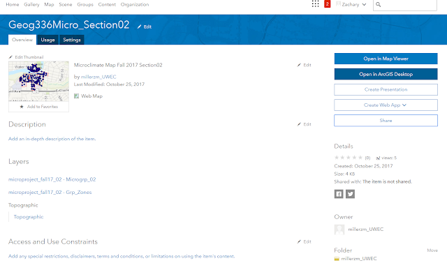
After the data has been collected in the ArcCollector app (see figure 3), navigate to ArcGIS Online at a desktop computer. Log in with the appropriate credentials and a map with the collected points will be available for use under My Content. Open the map details and click Open in ArcGIS Desktop (shown in figure 5).
 |
| Figure 5: Open in ArcGIS Desktop. |
From there, the data points, all attributes collected , group study areas, and basemaps are available to create a series of microclimate maps.
Results
The two resulting maps show 1. Wind speed and direction and 2. Temperature of various points collected by the students of this class. Of course, there was some error in data entry, however, for the most part the data collected was good data. Personally, I accidentally entered in wrong data and had to go back and change it before moving on to the next point, but error can occur easily when using this app if the collector isn't careful.
 |
| Figure 6: Wind speed and direction map. |
 |
| Figure 7: Temperature map. |
Discussion
Looking at the results first, the wind speed and direction map was really interesting. I've never used the rotation symbology feature before but it's cool that from the data (wind speed and direction) a map such as this could be made, all because my classmates and I collected the information. The temperature map was also intriguing. Seeing as the study area only covers less than a square mile, one would think the temperature wouldn't vary a whole lot. With the data collected, however, there was over a 20° difference in some places on campus.
Overall, I thought the ArcCollector app was an efficient and easy-to-use data collection app. The real-time data point map was a cool feature- especially when we were out in the field, it helped my partner and I to keep up with the rate at which other students were collecting their data. From an administrative standpoint, this feature could be useful in ensuring that students/employees/etc are indeed collecting data. Other than a few incorrect entries, the data was fairly consistent, so symbolizing and classifying the data was easy to do.
No comments:
Post a Comment